
The past few weeks, I have talked about colors, stroke, and techniques, but one of the most important things to make a great drawing is... how you put all them together.

It happens to draw something technically perfect, right colors, clean strokes, but... there is something that feels wrong: the elements you have drawn do not stand out as you would want them to or they are too densely packed in a particular area and too sparse on other parts. Basically, there is a layout problem, but there are some rules which can help you out here too.
It is extremely important to focus and analyze three aspects of your composition: position, size, and weight. Before doing that, we need to step back a bit and consider what a composition element is. Essentially, anything inside your drawing is a unique "element" of its layout: from the main subject to its parts and the decoration items.
On a limited surface like the one available on a normal piece of paper or a painting canvas, our eye will inevitably focus on some specific parts of the surface even though you might be able to see the entire thing at once. So, it is key that you place the important composition elements exactly in those spots.

You can usually find the first focus point by tracing the space's median lines: our brain is naturally attracted by symmetries, so any element placed on an axis of symmetry will appear to be more important than other ones. If you plan a symmetrical composition, the middle of the drawing will be the key focus point and the composition will tend to have more of a static look.
A more dynamic layout will occur if you place your elements across diagonal lines and even more if you occasionally break the painting's own symmetry.
Another interesting area our eyes will tend to focus on is the horizontal strip you obtain if you divide the drawing in three parts with parallel lines, especially if we place them horizontally.

Try watching a close-up in a movie, if you pay attention to it you will notice that, if the movie has a decent photography of course, that 2/3 line is the line along which the character's eyes sit on.
The mouth will of course be placed on the opposite line (the first one and the one marking the first third of the image). You will have to agree that such element is quite essential to communicate, right?

The size of each element can drawn our attention too, of course, if we talk about something being big compared to the space available on the sheet of paper and in which perspective can take a leading role making a small mice on the foreground look as big as an elefant.
It might appear to be an obvious statement, but it is not a given that a small element can stand out more than a ten times bigger one if it feels heavier.

The weight in this case results from the color of the bird, by the contrast with the background and by its brightness and/or saturation. You have to also consider that there are more "active" colors than others and which draw our attention the most. A common example would be the color red, a color which stands for excitement, but you could also talk about blue which is linked to calm and reflective thoughts.
So, in order to balance our layout better, it will be necessary for us to be careful when we place big or heavy elements in our layout, making sure that there is a large group of small elements placed on the opposite side of the drawing. This is one of the steps you should take to help the layout be as balanced as possible which is extremely important.

In order to make following these rules as effortless and as natural as possible, it would be a good exercise for you to practice with as many images as you can: illustrations, paintings, photographs, and as I said particular sequences in movies too. You will find that nice and well realized images will always show a certain relation between its building blocks and will follow the rules I mentioned here.
The pictures I have used in this tutorial come from Charley Harper's works, an illustration genius born in the United States of America who developed clear and well organized illustrations composed by simple very well balanced shapes and which help us see the use of these layout rules well.

To view the previous tutorials you can click HERE.

Illustration by Charley Harper
It happens to draw something technically perfect, right colors, clean strokes, but... there is something that feels wrong: the elements you have drawn do not stand out as you would want them to or they are too densely packed in a particular area and too sparse on other parts. Basically, there is a layout problem, but there are some rules which can help you out here too.
It is extremely important to focus and analyze three aspects of your composition: position, size, and weight. Before doing that, we need to step back a bit and consider what a composition element is. Essentially, anything inside your drawing is a unique "element" of its layout: from the main subject to its parts and the decoration items.
On a limited surface like the one available on a normal piece of paper or a painting canvas, our eye will inevitably focus on some specific parts of the surface even though you might be able to see the entire thing at once. So, it is key that you place the important composition elements exactly in those spots.

Perfect symmetry on every axis. The insect in the middle is the focus of the composition: the only one that can unblock the situation (Illustration by Charlie Harper)
You can usually find the first focus point by tracing the space's median lines: our brain is naturally attracted by symmetries, so any element placed on an axis of symmetry will appear to be more important than other ones. If you plan a symmetrical composition, the middle of the drawing will be the key focus point and the composition will tend to have more of a static look.
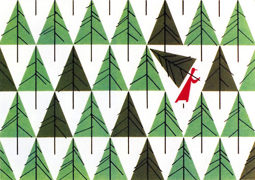
A more dynamic layout will occur if you place your elements across diagonal lines and even more if you occasionally break the painting's own symmetry.
Little Red Riding Hood breaks the repetition of elements and their symmetrical placement. (Illustration by Charley Harper)
Another interesting area our eyes will tend to focus on is the horizontal strip you obtain if you divide the drawing in three parts with parallel lines, especially if we place them horizontally.
The Little Owls' eyes are situated above the imaginary ~2/3 line, their feet are in the lower part of the image, while the white vertical lines help to bring our attention to the menacing eyes of their parents and away from their eggs (Illustration by Charley Harper)
Try watching a close-up in a movie, if you pay attention to it you will notice that, if the movie has a decent photography of course, that 2/3 line is the line along which the character's eyes sit on.
The mouth will of course be placed on the opposite line (the first one and the one marking the first third of the image). You will have to agree that such element is quite essential to communicate, right?
The little red bird rises above the seeds around it even though some of them are almost as big as he is, but we do not notice it at first sight usually. (Illustrazione di Charley Harper)
The size of each element can drawn our attention too, of course, if we talk about something being big compared to the space available on the sheet of paper and in which perspective can take a leading role making a small mice on the foreground look as big as an elefant.
It might appear to be an obvious statement, but it is not a given that a small element can stand out more than a ten times bigger one if it feels heavier.
Here the red bird is close to the other ones in size, but stands out the most thanks to the way it has been colored, but it is also the most static element of the layout because it sits at the center of the image and appears much more symmetric. (Illustration by Charley Harper)
So, in order to balance our layout better, it will be necessary for us to be careful when we place big or heavy elements in our layout, making sure that there is a large group of small elements placed on the opposite side of the drawing. This is one of the steps you should take to help the layout be as balanced as possible which is extremely important.
The bright color and the waves around the leaf help it stand out and to provide balance to the darker and more fragmented lobsters on the opposite side. (Illustration by Charley Harper)
In order to make following these rules as effortless and as natural as possible, it would be a good exercise for you to practice with as many images as you can: illustrations, paintings, photographs, and as I said particular sequences in movies too. You will find that nice and well realized images will always show a certain relation between its building blocks and will follow the rules I mentioned here.
The pictures I have used in this tutorial come from Charley Harper's works, an illustration genius born in the United States of America who developed clear and well organized illustrations composed by simple very well balanced shapes and which help us see the use of these layout rules well.
To view the previous tutorials you can click HERE.
No comments:
Post a Comment