Showing posts with label ENG. Show all posts

Tuesday, September 18, 2012

Welcome to our ETSY e-shop!

AddictiveColors has opened a shop on Etsy!
Visit OUR PAGE and check out  our new handmade items!
Follow Us on Facebook, some new item every week.
AddictiveColors ha aperto anche su Etsy!
Visita il nostro SHOP, scopri i nostri prodotti FATTI A MANO!
Seguici anche su Facebook per tutte le novità.

Friday, June 29, 2012

Il quaderno di Simone Rea per Kokkino.


Questa mattina ho trovato nella buca delle lettere un pacchetto contenente il premio per "Amici della Rana": un bellissimo quadernetto della Kokkino illustrato da Simone Rea.
 Grazie ancora a Simone e a voi che avete votato la mia ranocchia!
This morning I received the prize for the  "Amici della Rana" contest in the mail: a beautiful pocket notepad illustrated by Simone Rea and produced by Kokkino.
Thank you again Simone and everyone else who voted for my Frog!

Monday, June 18, 2012

Illustrated Tale

A few pictures from a story written by Flavio Zenes and illustrated by AddictiveColors on Tiramisù alle Fragole.

Un po' di immagini del racconto di Flavio Zene illustrato da AddictiveColors per il blog di Tiramisù alle Fragole.


Monday, April 16, 2012

Welcome to the Jungle!

A new tile map I created to experiment with a different setting.
You can find the old one HERE.

Friday, April 13, 2012

iOS and App Store icons

Several icons needed for Universal app (click to expand)
Developing a good Universal application capable of running at its best on iPhone/iPod touch and iPad all with regular display and the retina one requires a lot of work, a non trivial part of which goes into making sure you have all the required and "suggested" icons available so that the application looks nice on the Home screen, on iTunes, and so on. With the new iPad and its retina display there is one more set of Icons for you to add, so other than suggesting to take a good look at the official Human Interface Guidelines document I would like to provide a small table with various icons and resources you need for your app and their suggested names. The icon names are not required to always be adamantly adherent to the old naming convention on new iOS releases, but it is better if you do follow them to maximize your app's compatibility with little effort after all.
I hope you find it useful, but if you have suggestions and/or errata to report please do so in the comments, thank you :)!

P.S.: you might find THIS tool useful.

Wednesday, April 11, 2012

When Unity gets along better with Android than iOS...


I have been toying with Unity 3D for a few weeks, following the decision to transition development of a game I am collaborating to a powerful and more designers friendly environment as requested.
I have to give the Unity team props for the improvements in Unity 3.5 - for example the improved versioning/Git support - and for the decision to give many developer a chance to get a good look at Unity on mobile platforms by giving out licenses for Unity Basic on iOS and Android. One does not work too well right now and the other one works better than I expected.

Sunday, April 8, 2012

Firefox, advancing the free web forward

The "dawn" of the web.

The "future" of the web.

The modern web is quite exciting for users and developers alike. For those of us who actually started with NCSA Mosaic and similar browsers (and even browsed the web with Dos browsers such as Arachne) or text based browsers, the modern web is an amazing leap forward we probably would have billed as a futuristic pipe-dream.
Web browsers are becoming little Operative Systems with threading support, 3D and 2D Hardware acceleration, 3D graphics support, interactive 2D canvas the web application can draw on, real-time audio processing, local data storage, asynchronous data transfer, etc... all with the help of open standards and the power of their embedded JavaScript engines allowing more and more versatile and dynamic elements to power the web (and more, see Unity 3D).
Users tend to load many web pages at once, they like to multi-task a lot and run heavier sites than they might give them credit for, so it is very important for web browsers to be faster, consume less memory, and offer better features for web designers willing to implement the modern audio and video tags for example.
Mozilla is doing a wonderful job in both the execution of this mandate and in involving users in the process by creating various powerful initiative that help you keep track of the progress done in all of those areas:

Keeping Track of User Experience problems
Checking JavaScript performance
Checking memory usage and memory optimization efforts
Test suite for audio playback on the open web

I invite you to check out all of those web sites and read through the various FAQ's detailing how the tests are run, what metrics they focus on, and how you can contribute to the tests or check up their testing methodology.

Thursday, April 5, 2012

Premultiplied hip hip.... huraaah!

Although I agree that premultiplied alpha is getting to be some sort of "thing you do, even without an alpha channel", it can make your life easier or in this case visualize PNG data into the Unity editor right. The following picture and related caption, illustrate a problem when alpha and blending are not working along right.
Image taken from Cocos2D's forums

Saturday, March 17, 2012

Cocos2D and PlayStation Suite

Some of you might already know the full details of this new Sony initiative (even though this Cocos2D inspired library might have slipped by too quietly), but if I had to make a short summary for the developers not working on iOS and Apple's tools (Xcode and Interface Builder), I would say... "somebody who cares about games and UI's landed on Android".

Tuesday, March 13, 2012

List of participating works 2012

As you may already know from this blog, we are participating to the BolognaRagazzi Digital Award contest. 
We wanted to let you know that the full list of applications submitted for the award is now

Wednesday, March 7, 2012

Drawing Tutorial 10 - Layout

The past few weeks, I have talked about colors, stroke, and techniques, but one of the most important things to make a great drawing is... how you put all them together.

Illustration by Charley Harper

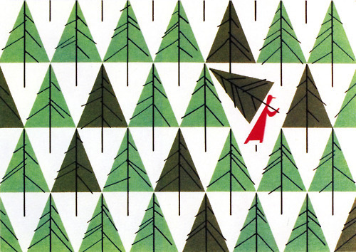
It happens to draw something technically perfect, right colors, clean strokes, but... there is something that feels wrong: the elements you have drawn do not stand out as you would want them to or they are too densely packed in a particular area and too sparse on other parts. Basically, there is a layout problem, but there are some rules which can help you out here too.

It is extremely important to focus and analyze three aspects of your composition: position, size, and weight. Before doing that, we need to step back a bit and consider what a composition element is. Essentially, anything inside your drawing is a unique "element" of its layout: from the main subject to its parts and the decoration items.
On a limited surface like the one available on a normal piece of paper or a painting canvas, our eye will inevitably focus on some specific parts of the surface even though you might be able to see the entire thing at once. So, it is key that you place the important composition elements exactly in those spots.

Perfect symmetry on every axis. The insect in the middle is the focus of the composition: the only one that can unblock the situation (Illustration by Charlie Harper)

You can usually find the first focus point by tracing the space's median lines: our brain is naturally attracted by symmetries, so any element placed on an axis of symmetry will appear to be more important than other ones. If you plan a symmetrical composition, the middle of the drawing will be the key focus point and the composition will tend to have more of a static look.
A more dynamic layout will occur if you place your elements across diagonal lines and even more if you occasionally break the painting's own symmetry.

Little Red Riding Hood breaks the repetition of elements and their symmetrical placement. (Illustration by Charley Harper)

Another interesting area our eyes will tend to focus on is the horizontal strip you obtain if you divide the drawing in three parts with parallel lines, especially if we place them horizontally.

The Little Owls' eyes are situated above the imaginary ~2/3 line, their feet are in the lower part of the image, while the white vertical lines help to bring our attention to the menacing eyes of their parents and away from their eggs (Illustration by Charley Harper)

Try watching a close-up in a movie, if you pay attention to it you will notice that, if the movie has a decent photography of course, that 2/3 line is the line along which the character's eyes sit on.
The mouth will of course be placed on the opposite line (the first one and the one marking the first third of the image). You will have to agree that such element is quite essential to communicate, right?

The little red bird rises above the seeds around it even though some of them are almost as big as he is, but we do not notice it at first sight usually. (Illustrazione di Charley Harper)

The size of each element can drawn our attention too, of course, if we talk about something being big compared to the space available on the sheet of paper and in which perspective can take a leading role making a small mice on the foreground look as big as an elefant.
It might appear to be an obvious statement, but it is not a given that a small element can stand out more than a ten times bigger one if it feels heavier.

Here the red bird is close to the other ones in size, but stands out the most thanks to the way it has been colored, but it is also the most static element of the layout because it sits at the center of the image and appears much more symmetric. (Illustration by Charley Harper)

The weight in this case results from the color of the bird, by the contrast with the background and by its brightness and/or saturation. You have to also consider that there are more "active" colors than others and which draw our attention the most. A common example would be the color red, a color which stands for excitement, but you could also talk about blue which is linked to calm and reflective thoughts.
So, in order to balance our layout better, it will be necessary for us to be careful when we place big or heavy elements in our layout, making sure that there is a large group of small elements placed on the opposite side of the drawing. This is one of the steps you should take to help the layout be as balanced as possible which is extremely important.

The bright color and the waves around the leaf help it stand out and to provide balance to the darker and more fragmented lobsters on the opposite side. (Illustration by Charley Harper)

In order to make following these rules as effortless and  as natural as possible, it would be a good exercise for you to practice with as many images as you can: illustrations, paintings, photographs, and as I said particular sequences in movies too. You will find that nice and well realized images will always show a certain relation between its building blocks and will follow the rules I mentioned here.
The pictures I have used in this tutorial come from Charley Harper's works, an illustration genius born in the United States of America who developed clear and well organized illustrations composed by simple very well balanced shapes and which help us see the use of these layout rules well.


To view the previous tutorials you can click HERE.

Thursday, March 1, 2012

Packaging

Every so often, new electronics products enter the market and when the product refresh cycle is usually in the 5-6 years range the change from the previous generation to the new one is usually a big deal.
The recent launch of PlayStation Vita, the brand new handheld gaming console from Sony, is quite a big gaming event for me due to the strength and versatility of the device, but it also gave me one chance to sit back and think about an aspect of modern products many people still take for granted even here in Europe where the problem should be much more apparent: packaging and paper waste.

Wednesday, February 29, 2012

Drawing Tutorial 9 - Color Correction


Let's continue with the almost too wide and open subject of colors which we have already explored a week ago. I would like to talk now about a way to create the exact color you need (for those of us who do not like rough approximations), a technique which helped me a lot when I worked in restoration and retouch.
What exactly is restoration about? It consists of integrating small missing pieces in frescoes and paintings through the use of new colors that are as close as possible to the ones used in the original work or at least the ones we believe to have been used. If the missing portion is too wide, you need a different technique though and generally you would choose the rigatino technique, but this is a quite off topic in this tutorial.
Also off topic would be answering to the question of why exactly I was working there in the first place, so let's just say that restoration is a valid branch of fine arts you can learn a whole lot from.
Anyways, our goal is to choose the color which most closely matches the original color. Often, the original colors do not have the same brightness as the colors you can prepare on your palette and obviously the way the original colors must have looked when they first used, due to the natural wear and tear caused by time and weather. Another issue could be that the colors' tone seem to be opaque in a way that we cannot exactly match with the colors we have. What should we do?
A quick solution is to add, for example, a small drop of a complementary color to our way to bright and shiny color. I happened to buy a green color which ended up being quite far from what I planned to buy. I wanted a "natural" green to paint leaves with and even though I went to the store with a neutral green in mind (not too yellow, not too blu), the green I bought is actually a very cold and artificial green, similar to the artificial color they use for mint flavored candies. It is a very bright green, but adding a little bit of amaranth red made toned it down just the way I wanted.
Of course, it needs a keen eye and a lot of practice to get it right, but this advice, which I received from my boss at that time, has always been useful.

Another little insider tip, useful to get the naturally pure yet very transparent watercolors to be more "candy"-like, consists of using "Giallo Napoli" (very light yellow, almost white, verging on pink).
If you add some "Giallo Napoli" to electric blue, you will end up with a cobalt blue with a warm yet light color tone thanks to the yellow component used. Do not worry about turning it into green: if you do not add too much of it, it will not turn the blue into green even though it is called Naples Yellow after all.
If you want to exercise yourself with re-creating a specific color, go ahead and experiment: take for example a color photograph from a magazine,


cut away or rip off some pieces of the picture and paste the picture onto a white sheet of paper (in this case I made some holes with my scissors and the ripped the page off),


and then I tried to paint the missing parts of the picture to make sure the holes are not visible anymore.


It is always best to check the color only after it is fully dry when dealing with gouache  because it could get lighter than you expect. Please forgive my practical example if the colors do not match the original color exactly: I did not have enough time and I did not wait for the paint to dry and you can see how this affected the results. Anyways, the basic points behind this technique are the ones I mentioned before, the challenge for the artist is to get as close as possible to the specific color we want or need to reproduce.
This week's video might not have much to do with this topic, but it served its purpose to show the various shades of green I was able to obtain by properly mixing some red (leaf on the right) to the "wrong" green (first leaf on the left).

To view the previous tutorials click HERE.

Thursday, February 23, 2012

Man of Sound

Pocket Boy's got a voice now! Well, he does not say a word while sitting inside a pocket, but the world around him received a fresh coat of colorful sounds. This was possible thanks to the help of Kristian Johansson, a 31 year old Swedish sound designer, aka  The Man of Sound.
The Man of Sound, as you can guess from his name, has been working for quite a while on sound effects, music, and game interfaces, but he is also well known for co-creating and co-hosting the #1 Gaming podcast in Sweden.
With The Man of Sound taking care of Pocket Boy's audio presentation we knew we had received the help of a talented professional, but we did not expect he could get so into Pocket Boy and understand it as in depth as he did. He managed to compose music and sounds which were incredibly close to the idea we had in our mind but could not put down in musical notes.
To understand his work better and to take a glimpse at the behind the scenes of the new music inside this update, we decided to ask a few question about Pocket Boy and his profession in general.

Pocket Boy ha finalmente una voce, o meglio: continua a stare zitto nelle tasche, ma attorno a lui il mondo si è "colorato" di suoni. Tutto ciò è avvenuto grazie a Kristian Johansson, 31 anni svedese, in arte The Man of Sound. 
The Man of Sound, come si evince dal nome, si occupa ormai da tempo di effetti sonori, suoni d'ambiente e per interfacce nell'ambito dei videogiochi. Ma ha anche condotto per diversi anni il più popolare podcast svedese sui videogiochi.

Wednesday, February 22, 2012

Drawing Tutorial 8 - Composing Colors

In the previous tutorial, I introduced some practical watercolor techniques.  
Before going ahead with more practical subjects, I wanted to stress that it is always important to keep in mind exactly what you want to create and the look you want to give it. 
Once in a while, I get stuck choosing colors, but I know it is a very common issue and I had to come up with a series of tricks that can help the chromatically undecided.
First of all, there are websites dedicated to color combinations such as COLOURlovers, a web community in which you can look for the perfect color combination, help other create their own, or just find some inspiration.
Another helpful color theory guide was published as a series of tutorials on "Le figure dei Libri" not too long ago: it is a very interesting look on everything about illustration and the world around it written by the illustrator Anna Castagnoli and with color theory lessons by Francesca Cheessa.


As far as my own advices for you are concerned, I would say that you should always start with the least amount of colors possible, no more than 3 colors. The concept is simple: with one color there can be no problem because your monochrome painting will only vary in its tone, saturation, and/or brightness.

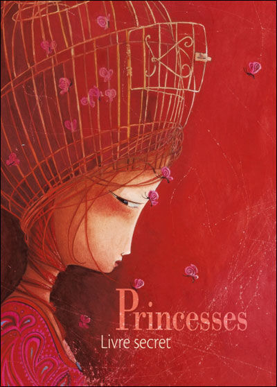
The above illustration comes from a book by Rebecca Dautremer, you can see a dominating red in all its tone variations: from magenta to light cadmium red and to delicate pink ones.


If you have two colors, it is good to choose two complementary ones (red/green, yellow/violet, blue/orange), but pay attention not to create a "contrast of complementary colors": the unpleasant visual effect due to two colors with the same wavelength that makes everything almost unreadable (it is banned in advertising). If you work digitally and you want to prevent this nasty issue from happening to your drawings, you just need to lower the overall saturation and go back to grey-scale temporarily: if you are still able to make out shapes and see the overall image then you are good to go, but if everything starts to blend together then you have chosen colors that have a very similar wavelength and thus will be reduced to approximately the same grey tone. 

   
In the above illustration, by Rebecca Dautremer, you can see the artist playing around with essentially only red and green tones.
Now, if we have chosen three colors, we should take either the three primary colors (Red, Green, and Blue) or the three secondary ones (Green, Purple, and Orange). Obviously, three simple colors can only do so much, unless you are going for  a very minimalist look and are not trying to create a very particular atmosphere. 

Color tones come to our rescue once again though. We can use multiple tones for the first two colors mixed with the third chosen color. As you can see in the above illustration, once again by Rebecca Dautremer, red and blue/light blue are mixed with some yellow. Red is now almost orange, light blue is now aqua, and while yellow is surely the less saturated color it is also the most used. 


If you still have doubts on the color range to use, and most of all if you are unsure about the proportion between the chosen colors, you can use a very valid technique you can find at the following LINK where the harmonious tones can be selected covering the provided color wheel using a flat sheet of paper with a rectangular hole in the middle.

To view the previous tutorials, you can click HERE

Monday, February 20, 2012

Pocket Boy gets the sound

Pocket Boy has been really busy lately trying to collect a good sound library to make the interactive experience in each page even richer and inspiring. Thankfully, The Man of Sound (aka Kristian Johansson) came to his rescue.

Wednesday, February 15, 2012

Drawing Tutorial 07- Watercolors

There are various water-painting techniques depending on the end result you are trying to achieve, but you need to make sure you have the proper equipment to exploit these techniques to their fullest.
(QUI la versione in Italiano)
The first item is the brush: it is important that you have a brush with a "steady head", that is a brush that has soft bristles, but reverts back to its original shape even after you pass your finger on it.
One brush, many sizes
I tend to use round synthetic brushes that are rather large (size between 8-20) because they allow me to pick up more water and color and I can change the lines' width (the brush has a pointy end) depending on how much pressure I apply to the paper sheet with my brush. Brushes maker "da Vinci" is a brand I feel confident to recommend: you can find it in your local art shops and it is not cheap, but if you want a decent enough result you really have to steer away from "el cheapo" ones where the tip of the brush has been covered with some glue to make it look more sturdy. You know the quality of a brush once you have tipped it in water and you see it loosing its pointy shape or not.

Friday, February 10, 2012

Games as an art form

... just like movies and music, in which the dealer (aka the publisher) gets paid, gives the creator nothing, and cries over piracy and used sales as if they stifled creativity the most.

http://machinestudios.co.uk/viewentry.php?id=45

Enjoy the read, or not..

Thursday, February 9, 2012

Publishing to the Android Market or the Apple AppStore ?


Versione in Italiano pubblicata su coconity.com

There is a lot of talk about the constant competition of the Android Market vs. the Apple App Store; today we would like to discuss our experience as developers.
We think it may be useful to highlight the problems we faced, and that also means a very broad discussion has to be developed specifically for the various issues.

To market our first App, “Pocket Boy”, we had to make a choice between two pathways: Apple’s App Store or Google’s Android Market.
For several reasons, our choice fell on the Apple’s App Store, due to what could be more appropriate for our specific needs. We did not mean to sponsor a market rather than another one, and now we would like to explain as objectively as possible the questions we set to make these choices.
Related Posts Plugin for WordPress, Blogger...