Wednesday, February 29, 2012

Drawing Tutorial 9 - Color Correction


Let's continue with the almost too wide and open subject of colors which we have already explored a week ago. I would like to talk now about a way to create the exact color you need (for those of us who do not like rough approximations), a technique which helped me a lot when I worked in restoration and retouch.
What exactly is restoration about? It consists of integrating small missing pieces in frescoes and paintings through the use of new colors that are as close as possible to the ones used in the original work or at least the ones we believe to have been used. If the missing portion is too wide, you need a different technique though and generally you would choose the rigatino technique, but this is a quite off topic in this tutorial.
Also off topic would be answering to the question of why exactly I was working there in the first place, so let's just say that restoration is a valid branch of fine arts you can learn a whole lot from.
Anyways, our goal is to choose the color which most closely matches the original color. Often, the original colors do not have the same brightness as the colors you can prepare on your palette and obviously the way the original colors must have looked when they first used, due to the natural wear and tear caused by time and weather. Another issue could be that the colors' tone seem to be opaque in a way that we cannot exactly match with the colors we have. What should we do?
A quick solution is to add, for example, a small drop of a complementary color to our way to bright and shiny color. I happened to buy a green color which ended up being quite far from what I planned to buy. I wanted a "natural" green to paint leaves with and even though I went to the store with a neutral green in mind (not too yellow, not too blu), the green I bought is actually a very cold and artificial green, similar to the artificial color they use for mint flavored candies. It is a very bright green, but adding a little bit of amaranth red made toned it down just the way I wanted.
Of course, it needs a keen eye and a lot of practice to get it right, but this advice, which I received from my boss at that time, has always been useful.

Another little insider tip, useful to get the naturally pure yet very transparent watercolors to be more "candy"-like, consists of using "Giallo Napoli" (very light yellow, almost white, verging on pink).
If you add some "Giallo Napoli" to electric blue, you will end up with a cobalt blue with a warm yet light color tone thanks to the yellow component used. Do not worry about turning it into green: if you do not add too much of it, it will not turn the blue into green even though it is called Naples Yellow after all.
If you want to exercise yourself with re-creating a specific color, go ahead and experiment: take for example a color photograph from a magazine,


cut away or rip off some pieces of the picture and paste the picture onto a white sheet of paper (in this case I made some holes with my scissors and the ripped the page off),


and then I tried to paint the missing parts of the picture to make sure the holes are not visible anymore.


It is always best to check the color only after it is fully dry when dealing with gouache  because it could get lighter than you expect. Please forgive my practical example if the colors do not match the original color exactly: I did not have enough time and I did not wait for the paint to dry and you can see how this affected the results. Anyways, the basic points behind this technique are the ones I mentioned before, the challenge for the artist is to get as close as possible to the specific color we want or need to reproduce.
This week's video might not have much to do with this topic, but it served its purpose to show the various shades of green I was able to obtain by properly mixing some red (leaf on the right) to the "wrong" green (first leaf on the left).

To view the previous tutorials click HERE.

Thursday, February 23, 2012

Man of Sound

Pocket Boy's got a voice now! Well, he does not say a word while sitting inside a pocket, but the world around him received a fresh coat of colorful sounds. This was possible thanks to the help of Kristian Johansson, a 31 year old Swedish sound designer, aka  The Man of Sound.
The Man of Sound, as you can guess from his name, has been working for quite a while on sound effects, music, and game interfaces, but he is also well known for co-creating and co-hosting the #1 Gaming podcast in Sweden.
With The Man of Sound taking care of Pocket Boy's audio presentation we knew we had received the help of a talented professional, but we did not expect he could get so into Pocket Boy and understand it as in depth as he did. He managed to compose music and sounds which were incredibly close to the idea we had in our mind but could not put down in musical notes.
To understand his work better and to take a glimpse at the behind the scenes of the new music inside this update, we decided to ask a few question about Pocket Boy and his profession in general.

Pocket Boy ha finalmente una voce, o meglio: continua a stare zitto nelle tasche, ma attorno a lui il mondo si è "colorato" di suoni. Tutto ciò è avvenuto grazie a Kristian Johansson, 31 anni svedese, in arte The Man of Sound. 
The Man of Sound, come si evince dal nome, si occupa ormai da tempo di effetti sonori, suoni d'ambiente e per interfacce nell'ambito dei videogiochi. Ma ha anche condotto per diversi anni il più popolare podcast svedese sui videogiochi.

Wednesday, February 22, 2012

Drawing Tutorial 8 - Composing Colors

In the previous tutorial, I introduced some practical watercolor techniques.  
Before going ahead with more practical subjects, I wanted to stress that it is always important to keep in mind exactly what you want to create and the look you want to give it. 
Once in a while, I get stuck choosing colors, but I know it is a very common issue and I had to come up with a series of tricks that can help the chromatically undecided.
First of all, there are websites dedicated to color combinations such as COLOURlovers, a web community in which you can look for the perfect color combination, help other create their own, or just find some inspiration.
Another helpful color theory guide was published as a series of tutorials on "Le figure dei Libri" not too long ago: it is a very interesting look on everything about illustration and the world around it written by the illustrator Anna Castagnoli and with color theory lessons by Francesca Cheessa.


As far as my own advices for you are concerned, I would say that you should always start with the least amount of colors possible, no more than 3 colors. The concept is simple: with one color there can be no problem because your monochrome painting will only vary in its tone, saturation, and/or brightness.

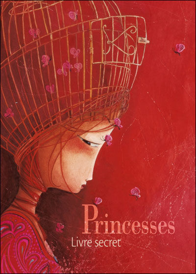
The above illustration comes from a book by Rebecca Dautremer, you can see a dominating red in all its tone variations: from magenta to light cadmium red and to delicate pink ones.


If you have two colors, it is good to choose two complementary ones (red/green, yellow/violet, blue/orange), but pay attention not to create a "contrast of complementary colors": the unpleasant visual effect due to two colors with the same wavelength that makes everything almost unreadable (it is banned in advertising). If you work digitally and you want to prevent this nasty issue from happening to your drawings, you just need to lower the overall saturation and go back to grey-scale temporarily: if you are still able to make out shapes and see the overall image then you are good to go, but if everything starts to blend together then you have chosen colors that have a very similar wavelength and thus will be reduced to approximately the same grey tone. 

   
In the above illustration, by Rebecca Dautremer, you can see the artist playing around with essentially only red and green tones.
Now, if we have chosen three colors, we should take either the three primary colors (Red, Green, and Blue) or the three secondary ones (Green, Purple, and Orange). Obviously, three simple colors can only do so much, unless you are going for  a very minimalist look and are not trying to create a very particular atmosphere. 

Color tones come to our rescue once again though. We can use multiple tones for the first two colors mixed with the third chosen color. As you can see in the above illustration, once again by Rebecca Dautremer, red and blue/light blue are mixed with some yellow. Red is now almost orange, light blue is now aqua, and while yellow is surely the less saturated color it is also the most used. 


If you still have doubts on the color range to use, and most of all if you are unsure about the proportion between the chosen colors, you can use a very valid technique you can find at the following LINK where the harmonious tones can be selected covering the provided color wheel using a flat sheet of paper with a rectangular hole in the middle.

To view the previous tutorials, you can click HERE

Monday, February 20, 2012

Pocket Boy gets the sound

Pocket Boy has been really busy lately trying to collect a good sound library to make the interactive experience in each page even richer and inspiring. Thankfully, The Man of Sound (aka Kristian Johansson) came to his rescue.

Thursday, February 16, 2012

Sostenibilità (2° parte)

In campo digitale grandi e piccole aziende stanno pensando sempre di più alla produzione ecologica attraverso fonti rinnovabili e sistemi progettuali sostenibili. Ci sono però ancora molti luoghi comuni e informazioni non del tutto chiare sui prodotti definiti eco-sostenibili.
Mi viene in mente ad esempio QUESTO articolo a proposito di Google Black.
Mi pare che, anche per chi è veramente interessato a questi argomenti, ci sia ancora troppa poca informazione a riguardo.
Per questo la scorsa settimana abbiamo iniziato a parlare di “Sostenibilità” con Erika Vicaretti, Maria Isabella Reggio e Roberta Destefanis tre giovani designer che si occupano di grafica, comunicazione e organizzazione di eventi sostenibili.
AddictiveColors: Molti brand e prodotti, dai più noti ai meno, si propongono promotori di produzioni ecologiche e sostenibili. Sono sempre veritiere queste campagne di comunicazione?

Wednesday, February 15, 2012

Drawing Tutorial 07- Watercolors

There are various water-painting techniques depending on the end result you are trying to achieve, but you need to make sure you have the proper equipment to exploit these techniques to their fullest.
(QUI la versione in Italiano)
The first item is the brush: it is important that you have a brush with a "steady head", that is a brush that has soft bristles, but reverts back to its original shape even after you pass your finger on it.
One brush, many sizes
I tend to use round synthetic brushes that are rather large (size between 8-20) because they allow me to pick up more water and color and I can change the lines' width (the brush has a pointy end) depending on how much pressure I apply to the paper sheet with my brush. Brushes maker "da Vinci" is a brand I feel confident to recommend: you can find it in your local art shops and it is not cheap, but if you want a decent enough result you really have to steer away from "el cheapo" ones where the tip of the brush has been covered with some glue to make it look more sturdy. You know the quality of a brush once you have tipped it in water and you see it loosing its pointy shape or not.

Tuesday, February 14, 2012

Sostenibilità (1° parte)


Usufruire al meglio del potenziale dei prodotti digitali, vuol dire anche avere un occhio di riguardo a progetti a ridotto impatto ambientale e sostenibili. Ma cosa significa davvero progettare in modo sostenibile?
Durante le 3 giornate di Faber meeting svoltesi a Novembre 2011, abbiamo avuto il piacere di conoscere altri partecipanti, tra cui Maria Isabella Reggio e Erika Vicaretti (il loro progetto è stato premiato al Faber con una Menzione speciale e una candidatura al premio internazionale ADI DESIGN INDEX 2012), che si occupano appunto di eventi e design eco-sostenibili assieme a Roberta Destefanis.
Da una piacevole chiacchierata sono sorti parecchi spunti interessanti, e abbiamo pensato di chiedere a loro di spiegarci qualche regola fondamentale per pensare e progettare in maniera quanto più sostenibile ed ecologica possibile.
Related Posts Plugin for WordPress, Blogger...